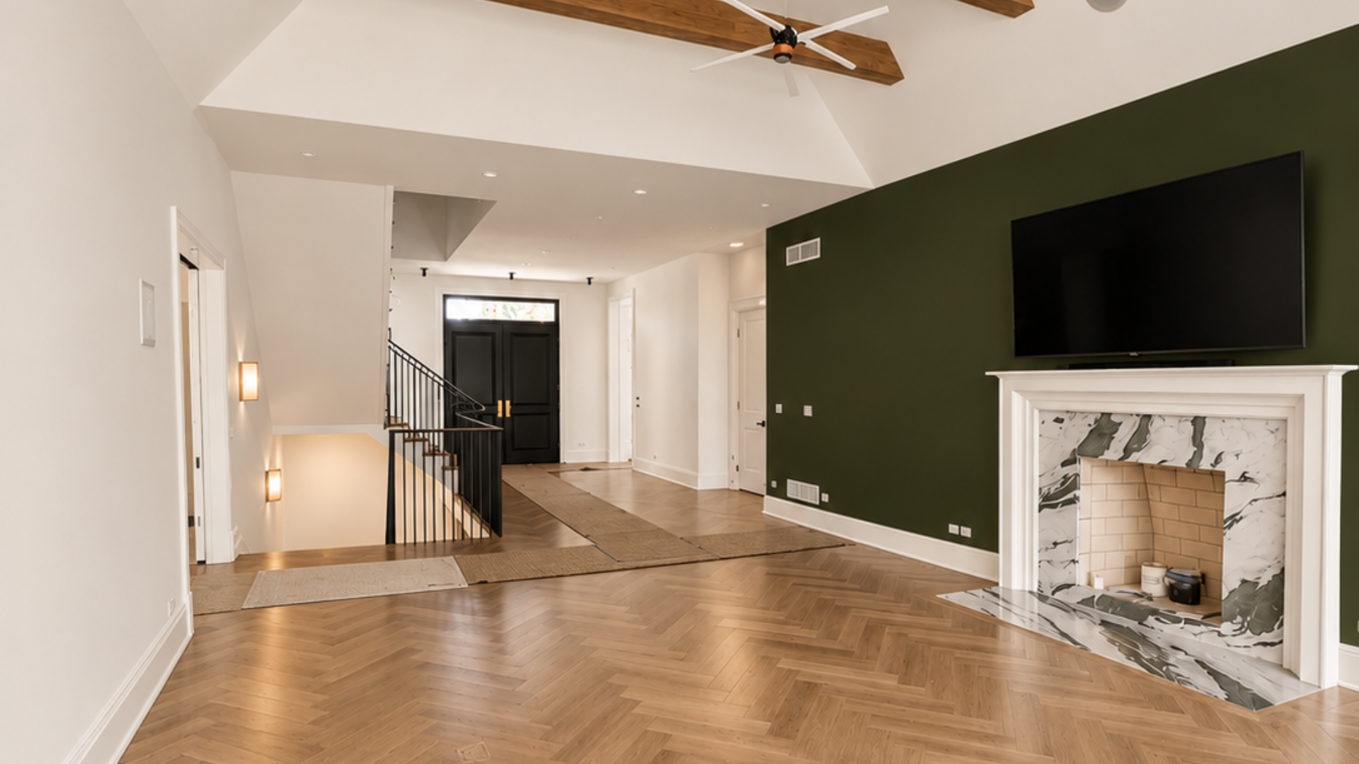
Every fall, the big paint companies pick a "Color of the Year." Most years they disagree. For 2027, all 3 of them landed on green. When Behr, Sherwin-Williams and Benjamin Moore agree on something, it's worth paying attention.
The 3 Greens, Side by Side
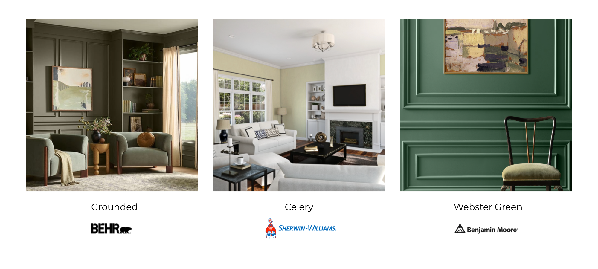
Here are the official picks, straight from the brands:
- Behr: Grounded. An earthy olive with brown undertones. Warm, calm and very forgiving. See Behr's announcement.
- Sherwin-Williams and HGTV Home: Celery (SW 6421). A soft, light herbal green. Fresh and airy without shouting. See the Sherwin-Williams and HGTV Home announcement.
- Benjamin Moore: Webster Green (HC-130). A classic mid-tone green from their Historical Colors line. Benjamin Moore pairs it with White Down (OC-131). See Benjamin Moore's announcement.
Think of it as light, medium and earthy. Pick the one that fits your room and your light, not the one with the best marketing.
A Quick Color Lesson (It Makes Choosing Way Easier)
You don't need an art degree. You need 4 ideas. Color is all about combining and pairing different colors to get different moods and feeling in your home. The four main focus points below will help you understand how to find a pairing that fits your vibe.
1. Undertones decide everything. Every green leans warm (toward yellow or brown) or cool (toward blue or gray). Grounded leans warm. Celery is light and soft. Webster Green sits in the middle. Hold your sample next to your floors, cabinets and countertops. If they fight, you'll feel it right away.
2. Complementary colors make green pop. Across the color wheel from green is red. That doesn't mean a red couch. It means warm, red-leaning accents like terracotta, rust, blush pink, copper or warm wood. A little goes a long way.
3. Analogous colors keep it calm. These are the neighbors of green on the wheel: blue-greens, teals and yellow-greens. Pair them for a quiet, layered room. Great for bedrooms and bathrooms.
4. Contrast is about light vs. dark, not just color. A mid-tone green next to a crisp off-white trim looks sharp. Green next to another mid-tone color can look muddy. If your room feels flat, you probably need more contrast, not more color.
One more rule we lean on: 60-30-10. About 60% of the room is your main color, 30% is a second color, and 10% is the accent. Green can play any of those roles. It doesn't have to be the walls.
Just Refreshing a Room? Start Here
Not every update needs a remodel. If you're refreshing before the holidays or this winter, green is easy to try in small doses.
- Kitchen: Paint the island or lower cabinets in Webster Green or Grounded and keep the uppers light. Brass or warm wood hardware is the complementary touch.
- Bedroom: Celery behind the bed is soft and restful. Add linen, light wood and a blush or rust pillow for contrast.
- Bathroom: A light green on the walls with white tile feels clean, not clinical. Small rooms are a cheap place to test a bold color.
- Living room: Try one accent wall, built-ins or a bookshelf back panel. Pair it with warm whites and wood tones.
- Front door: Grounded or Webster Green on a front door looks good on brick, gray siding and white trim alike.
Most of these are 1 to 2 day jobs for our interior painting crew.
Planning a Remodel? Build Green In From the Start
If you're redoing a kitchen, bath or basement, you have more control. Use it.
- Pick your fixed finishes first. Countertops, tile and flooring are expensive to change. Paint is not. Choose the green that works with them, not the other way around.
- Use green where it lasts. Painted cabinetry, a vanity, wainscoting or a mudroom bench gets you the look without committing every wall.
- Mind the undertones of new materials. White oak, walnut and cherry all change how green reads. Bring samples home together.
- Plan your whites. Trim, ceilings and cabinets in the same family of off-white tie the whole house together.
Where Green Can Go Wrong
- Dark, north-facing rooms can turn mid-tone greens gloomy. Go lighter, like Celery.
- Painting every room the same trend color is how you end up repainting in 3 years.
- Cheap paint and skipped prep will make any color look bad. That part isn't a trend. It's just true.
How to Test Before You Commit
Don't pick from a chip at the store. Paint big samples, at least 2 feet square, on 2 or 3 walls. Look at them in the morning, afternoon and at night with your lamps on. Live with them for a few days. If you still like it on day 3, you've got a winner.
Ready to Try a 2027 Green?
Whether it's 1 accent wall or a full kitchen remodel, our team at Chris Painting & Remodeling can help you pick the right shade and do the prep right. Family owned since 2003 and serving Chicagoland.
Call 773-895-5337 or request your free estimate today.